Usage
You can view the usage of the AI Agent for a specific time interval in the Usage menu of Analytics. In this menu, you can find three useful graphs.
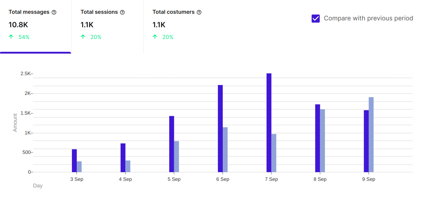
Counts
The Counts graph shows the number of messages, conversations, and customers for the selected time period and filters. You can also compare your data with the previous respective time period by ticking the respective box. Doing so will add new bars next to the existing ones in a grayer shade, as well as display the percentage increase or decrease in the number of messages, conversations, and customers.
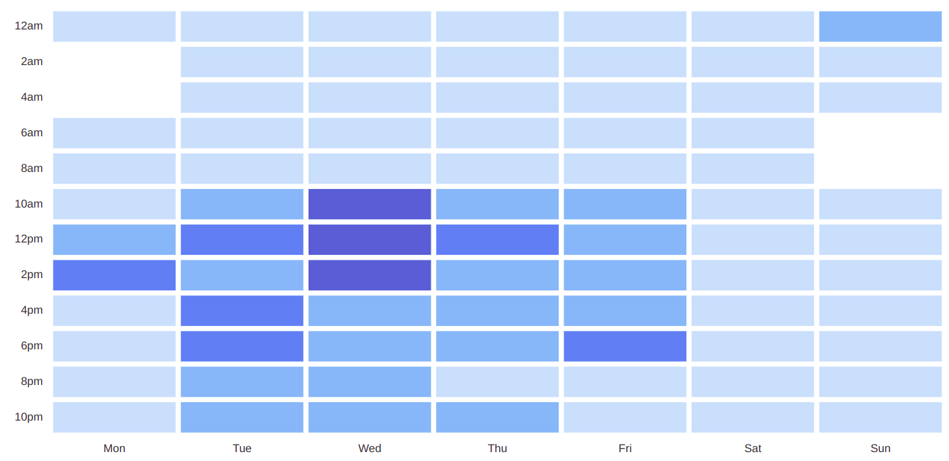
Messages by time of day
The Messages by time of day graph shows the number of messages sent to the AI Agent during specific time intervals within the day. Using this graph, you can extract useful conclusions about the distribution of messages. For example, in this graph, you can see that the volume of messages is particularly high between 10 AM and 2 PM on Wednesdays. This insight could help you schedule your live chat department to be active during that period. You can also hover your cursor over each box to get the specific number of messages during the respective time period.
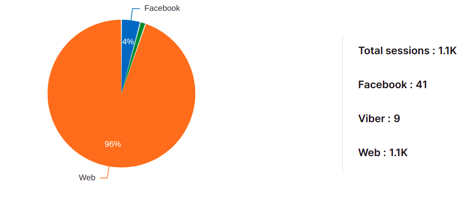
Conversations per channel
The Conversations per channel graph shows the distribution of conversations across different communication channels. This is helpful for analyzing which communication channels, such as Web, Facebook, or Viber, your users prefer for their conversations with the AI Agent.